You can often tell an amateur portfolio from a professional one in about four seconds, and it is rarely the work itself that gives it away. It is the type: a caption set in a third family, a paragraph in pale grey, a project title jammed against the photograph above it. Typography is the frame around your work, and a crooked frame makes even a good drawing look careless. Most of these mistakes take minutes to fix, and none of them require a design degree.
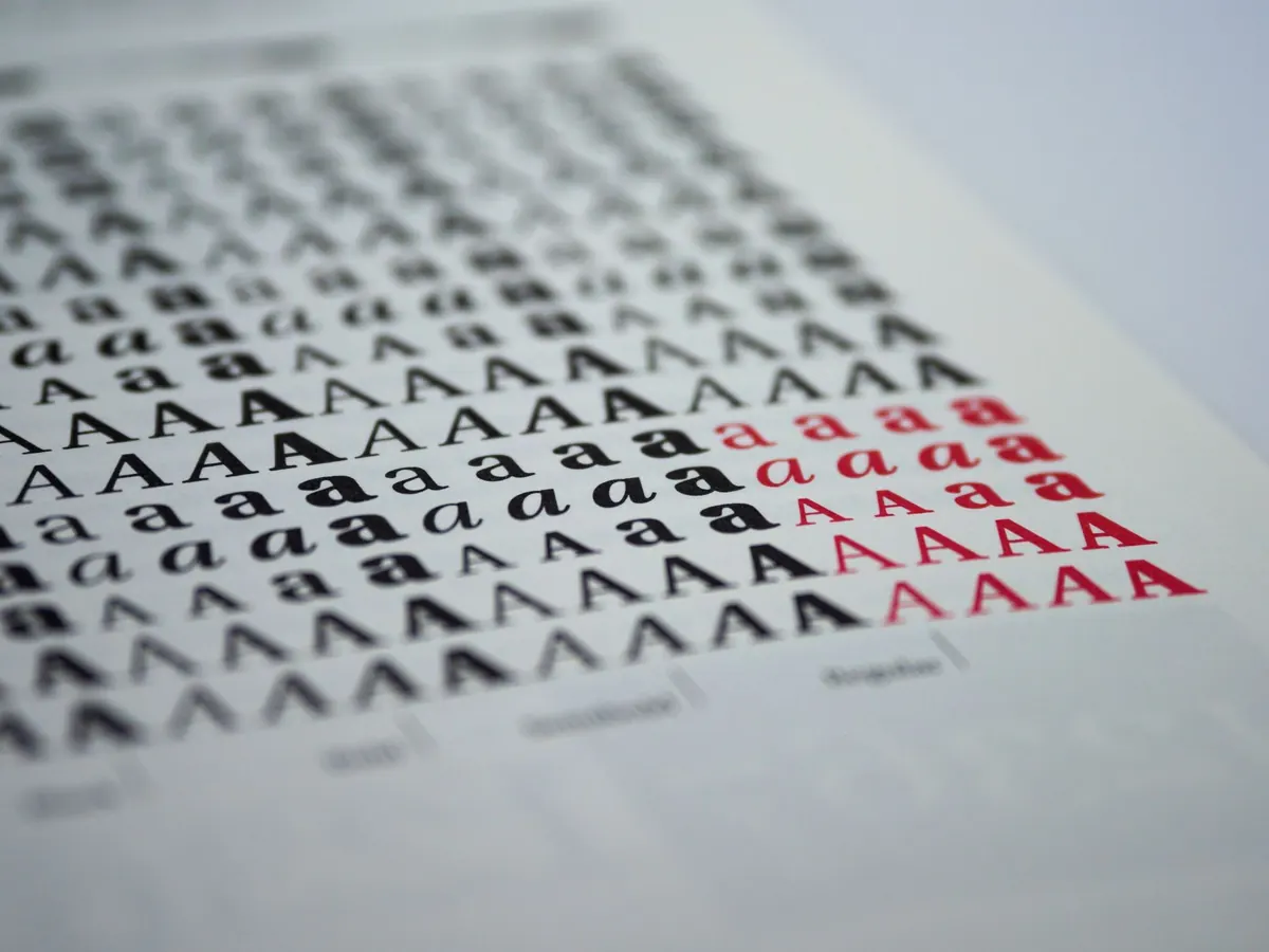
This is the mistake almost everyone makes first. A template supplies one font, the logo uses another, a display face gets added for personality, and captions drift into whatever was left over. Each choice seems reasonable on its own; together they read as noise, and noise is what makes a portfolio feel homemade.
Two families are usually plenty — one for structure, one for reading. More than that and you need a reason you can say out loud.
When in doubt, cut the decorative one. The face you notice first is usually the one fighting the work.
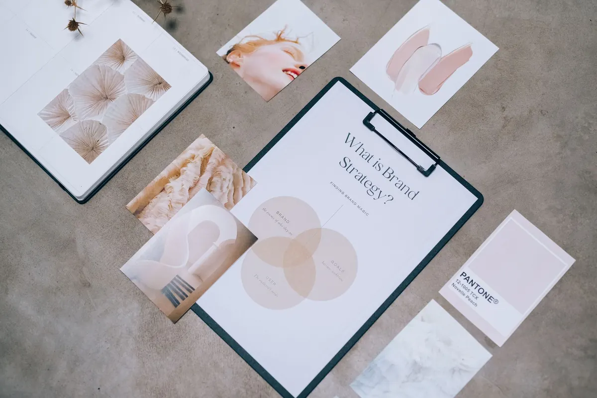
Without hierarchy, a page is a flat grey wall — project titles, dates, materials and paragraphs all set at the same size and weight. The viewer has to read in order to work out what to look at, and most will not bother.
Set three levels and hold them everywhere. A project title: large, and the only place your display face appears. A supporting line for medium, date or client: medium weight, slightly smaller. Body copy and captions: smallest, comfortable to read, no wider than about 65 characters. If you cannot tell two levels apart at arm's length, the difference is too small. A point of size and a slightly lighter grey is not a hierarchy; it is a smudge.
Pale grey body text on white is the most common readability failure in early-career portfolios. It looks elegant on a calibrated monitor at eleven at night and disappears on a phone in daylight.
Keep body text near-black — something in the region of #1a1a1a on white or off-white — and reserve grey for genuinely secondary detail such as a date or a caption label. WCAG AA asks for a contrast ratio of 4.5:1 for normal-sized text, and free contrast checkers will do the sum for you in seconds.
White type over an image is the other trap. Unless the photograph is uniformly dark and stays that way on every screen, add a solid or gradient scrim behind the text, or move the caption off the image altogether. Legibility beats atmosphere every time.
Spacing errors are harder to spot than a mismatched font but more damaging, because they make a layout feel shaky rather than deliberate.
Browser defaults are tight for paragraphs and loose for headlines. Around 1.5 works well for body text; for large display headings, pull it in to 1.1–1.2 so a two-line title reads as one block. Setting 1.8 on everything, headings included, spreads a page out and makes it feel uncertain.
Uppercase text always needs a little extra letter-spacing to stop letters colliding. Body text and headings never need it. Adding tracking to fix a font you dislike only makes the words harder to read — choose a different font instead.
Pick one spacing unit — 8px is common — and build every gap from multiples of it. Keep the space above a heading larger than the space below it, so the heading clearly belongs to the text that follows. Then keep margins consistent between projects; a viewer who sees four different left edges starts to doubt the precision of the work itself.
A paragraph stretched across a 27-inch screen can easily reach 150 characters per line. The eye loses its place on the return sweep. Set a maximum measure of roughly 60–75 characters — in CSS, max-width: 65ch on text blocks is a decent start — and let the whitespace either side do the framing.
Justified text without hyphenation is the second half of this mistake. Because browsers and templates rarely hyphenate well, justification opens up rivers of white space and uneven gaps between words. Ragged-right text is not lazy; it is the honest option on screen. Centred body copy has the same problem: fine for a one-line statement, unreadable across three paragraphs.
These are the last five per cent, and they separate a portfolio that looks considered from one that looks almost there.
If you only do one pass, do this one, in this order.
None of this is about taste. It is about removing the small distractions that compete with your work. Get the type quiet and consistent, and the portfolio starts to look like what it is: the work of someone who pays attention.
Photo: Monfocus / Pixabay