Most studios can present a client's work beautifully, then fumble the moment someone asks for their own logo in one colour. The brand kit lives in a folder called "logos final final", the typefaces sit on a laptop that left with a freelancer, and the Instagram grid gets improvised every Monday. None of that is unusual. It is just expensive in small, repeated ways: twenty minutes here, a rushed export there, a proposal that looks nothing like the last one.
The fix is not a rebrand. It is a tidy set of files and a handful of decisions written down. Here are the twelve assets worth having, how to build each one, and how to keep them usable when you are busy.
Work through this list once and you will have the bones of a brand system. Nothing here is decorative; each item solves a problem you have probably already hit.
A single PNG is not a logo kit. You want a folder that covers every situation without anyone having to open a design tool and improvise.
Name files so a stranger can find things without asking: studio-primary_black_rgb.svg beats logoNEW2final.svg. Lowercase, hyphens instead of spaces, and no dates unless the version genuinely matters.
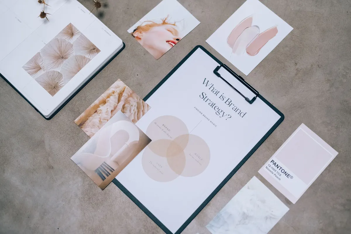
Colour and typography cause most of the quiet inconsistencies in a studio's own material. Two people pick two slightly different blues, and suddenly the website, the deck and the invoice all feel like they came from different companies.
Give every colour a job. A base, a text colour, a background tint or two, and one accent you use sparingly. Publish the codes together in one place, and check that your text and background combinations hold up: for body copy, aim for a contrast ratio of at least 4.5:1. That single check prevents most readability complaints before they arrive.
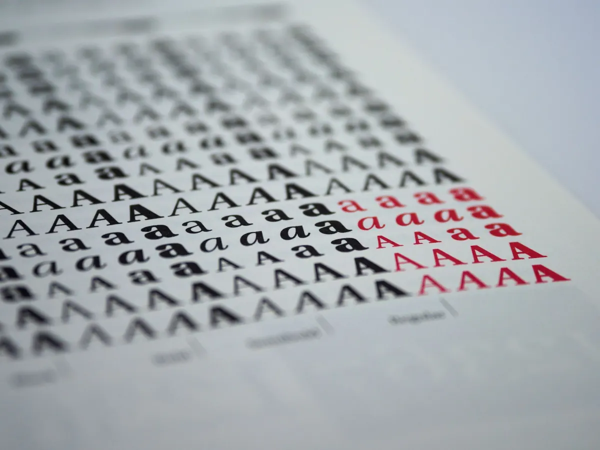
With type, the detail worth recording is licensing. Desktop licences and web licences are sold separately, and they usually limit the number of users and the kinds of work covered. Note the licence type, the number of seats and where the receipts are. Then add a fallback stack for the web, so a headline sets in something sensible when the webfont loads slowly.
Build templates in the tools you actually use, not the ones you admire. If your proposals go out as a Google Doc, a beautifully crafted InDesign file will never be opened.
Set them up once, with styles locked and placeholder text that reads like real content rather than lorem ipsum. A proposal template should need three things from you: the client's name, the project description and the price. Anything more fiddly and it will drift.
Keep a short written note of the page sizes, margins and export settings alongside the files. It takes five minutes and saves the next person twenty.
Most studios have a recognisable tone and no document describing it. That becomes a problem the first time you hand copywriting to a freelancer or let a new hire answer enquiries.
You do not need a forty-page manual. Three principles, each paired with a line you would actually write and a line you would avoid, is enough to steer someone. For example: plain-spoken, not blunt. We say "The timeline is tight, so here are two options." We do not say "Unfortunately, due to resource constraints."
Add three boilerplate descriptions of the studio at roughly 25, 50 and 100 words. They will be pasted into awards entries, directories and press requests more often than you expect, and having them ready keeps the voice consistent.
Sizes change, so keep layered source files rather than a folder of exports from 2019. Build templates with a generous safe area, so a caption or a UI element covering the edges does not ruin the layout.
Alongside the templates, keep a small bank of captions describing your services, your process and a typical project. Pair every image export with alt text written in the same voice, and your feed starts to sound like the rest of your brand rather than a separate project.
A brand kit fails for organisational reasons, not creative ones. A few habits keep it alive:
Start with the logo folder and the colour codes. Those two get used every week, and fixing them makes everything else easier to justify. If your brand decisions touch contracts, trademarks or licensing agreements, it is worth taking proper professional advice rather than relying on a folder structure.
Photo: Leeloo The First / Pexels